

Is Your CMS Responsive? – Don’t Leave Mobile Tech Out of Your Marketing Strategy
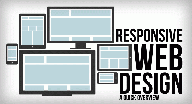
Responsive CMS
Imagine, for a moment, that you’re sitting in a waiting room. You know that you’re going to have a few minutes to kill while you wait on your appointment, so what are you doing? You’re probably scrolling through social media feeds or browsing online on your phone or tablet, right?
So why aren’t you concerned about mobile technology for your website?
The Numbers Don't Lie – Millions of Users Are Going Mobile
According to a recent Pew report, 42% of adults in the United States own tablets, and 32% own e-readers. Furthermore, 90% of American adults own cell phones, and of that 90%, 63% use their phones to go online on a regular basis.
If you do the math, that means that almost 57% of all adults in America are using smartphones to go online on a regular basis. With an overall population of nearly 250 million adults, that means that – in the US alone – there are almost 140 million adults going online with mobile tech.
Why Responsiveness Is Key
Now, you might be wondering, “Why does it matter if my audience is looking at my site on their phones, tablets, or computers?” If you go to your website on your laptop or desktop, you’re likely to see a beautiful layout that’s easily navigable.
Is the same true if you’re on your phone?
With a non-responsive web design, your site will look exactly the same on your phone or tablet as it does on your computer, but shrunken to fit the screen. To navigate, your audience is going to have to do a lot of pinching, swiping, scrolling, and zooming, and they’re going to get frustrated really quickly.
With responsive web design and other mobile-oriented design features, your content won’t be shrunken to the size of a postage stamp when your viewers and customers visit your site on their phones and other mobile devices. Navigation is easier, and they don’t have to do all that pinching and swiping to see the content they want to read or to check out the products they want to buy.
Choosing the Right CMS with Responsive Design
With the right CMS, you won’t have to worry about how your site looks on mobile devices because your design template will already be responsive and mobile-ready. When you create your site, you can look at it on any size screen and see a user-friendly, attractive site that will give your customers the experience they want.
As you plan your marketing strategy and build your website, make sure that you have mobile technology cemented in your plan. Those numbers we cited earlier are already high, and they’re only going to continue to rise in the future.
Stay ahead of the game, and choose a CMS that will account for all users’ experiences with your site, no matter what devices they’re using.
For a free demo of a CMS that will provide you with an attractive and responsive site across all kinds of devices, check out Umbrella CMS today.